
The Grid create beautifully crafted solutions to marketing challenges and help Brands tell their stories in compelling and memorable ways.

Our unique, insight-driven process helps us understand and trigger consumer responses. It also guides our strategic approach in delivering the right content in the right places at the right time.

We build a relationship and a bond with our clients, maintained by trust, commitment and hard work. Our aim is always to become the team clients want to spend time with and work together to create successful work we can all be proud of.
Brand Development
Brand Strategy
Advertising
Copywriting
Retail & Instore Campaigns
Digital Design
Art Direction
Graphic Design
Film Making
Packaging design
Film Production
Photography Production

Clients


The Grid creates beautifully crafted and engaging solutions to marketing challenges.

We build a relationship and a bond with our clients, maintained by trust, commitment and hard work. Our aim is always to become the team clients want to spend time with and work together to create successful work we can all be proud of. 

Brand Development
Brand Strategy
Advertising
Copywriting
Retail & Instore Campaigns
Digital Design
Art Direction
Graphic Design
Film Making
Packaging design
Film Production
Photography Production
Clients
Work
Work


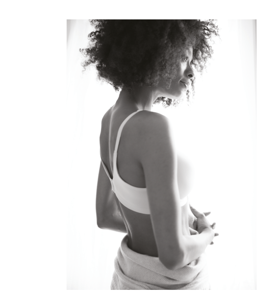
Retailer Mothercare asked us to develop, art direct and produce their seasonal photography for their recently re-vamped maternity sub-brand ‘Blooming Marvellous’.

Blooming Marvellous is an expertly designed wardrobe for mums-to-be and new mums. Covering everything from everyday essential denim to evening wear and lingerie.


Read More ×


Whereas many fashion brands are about the latest trends, Blooming Marvellous is a timeless wardrobe, focusing on style and beautifully tailored for the needs of motherhood. Our goal was to develop a photography and layout style for the brand and build on the personality created by Mothercare.
The results have been a huge stylistic step change for Blooming Marvellous changing the perceptions of the brand and successfully portraying the high quality design expertise that runs through the collections.


Back ×


Collaborating with the creative people at Clarks to develop a visual style and a communications strategy for their kids brands. To advertise and market its AW16 season we created a portfolio of beautifully stylised portraits that captured the personalities of the featured children. These portraits were then combined with still life shots of the season's shoes to create campaign artwork that could be used for all above the line marketing.


Collaborating with the creative people at Clarks to develop a visual style and a communications strategy for their kids brands. To advertise and market its AW16 season we created a portfolio of beautifully stylised portraits that captured the personalities of the featured children. These portraits were then combined with still life shots of the season's shoes to create campaign artwork that could be used for all above the line marketing.


Read More ×


Collaborating with the creative people at Clarks to develop a visual style and a communications strategy for their kids brands. As well creating new brands, we have helped direct and produce their global advertising and marketing assets.

For AW16 season, our objective was to create a global campaign that captured the spirit of the brand and produce a suite of supporting marketing assets. The creative would need to work across every conceivable channel, from social media to every customer touchpoint – including advertising, online, email marketing, direct marketing, wholesale trade, packaging, instore and point of sale.
Clarks were keen to move from a well-established lifestyle approach to a more design-led aesthetic so, for this season, we simplified the brand message, adopting a cleaner, more confident approach to presenting the shoes. We created a portfolio of beautifully stylised portraits that captured the personalities of the featured children. These portraits were then combined with still life shots of the shoes to create the lead campaign artwork that could be used for all above the line marketing.


Back ×


Too Small For School was one of 3 Back to School campaigns we created for Clarks in 2016. This emotive campaign was aimed at parents of 4-5 year old children. It tapped into insight that found 80% of parents felt anxiety around their child not being ready to start school. The narrative of the multichannel campaign was based around the set of rules that are commonly displayed in primary school reception classes.


Too Small For School was one of 3 Back to School campaigns we created for Clarks in 2016. This emotive campaign was aimed at parents of 4-5 year old children. It tapped into insight that found 80% of parents felt anxiety around their child not being ready to start school. The narrative of the multichannel campaign was based around the set of rules that are commonly displayed in primary school reception classes.


‘More Than a Beautiful Shoe’ is a short film made with artist and film maker Mac Premo and is used as a marketing asset to introduce the Clarks Kids brand to new markets. It shows the expertise, experience and love that goes into creating the best possible shoes for growing feet.


‘More Than a Beautiful Shoe’ is a short film made with artist and film maker Mac Premo and is used as a marketing asset to introduce the Clarks Kids brand to new markets. It shows the expertise, experience and love that goes into creating the best possible shoes for growing feet.


The Grid
92 De Beauvoir Road
London, N1 4EN

info@thegridcreative.com

+44 (0) 207 241 7766


©2018


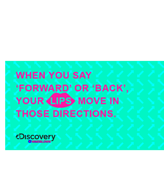
The Discovery Channel wanted to reimagine their Discovery Kids License brand which is a market leader in kids STEM products (Science, Tech, Engineering & Maths)

The new brand #MINDBLOWN connects and pulls together the broadcast shows, the digital content and the consumer goods in a bold, graphic style. The brand style uses a mix of icons, Emojis and colour to create bold and graphic art to tell stories, present experiments and give awesome facts. The brand builds clearer interactivity with the target audience through sharing and uploading content.


The Discovery Channel wanted to reimagine their Discovery Kids License brand which is a market leader in kids STEM products.

The new brand #MINDBLOWN connects and pulls together the broadcast shows, the digital content and the consumer goods in a bold, graphic style. The brand style uses a mix of icons, Emojis and colour to create bold and graphic art to tell stories, present experiments and give awesome facts.


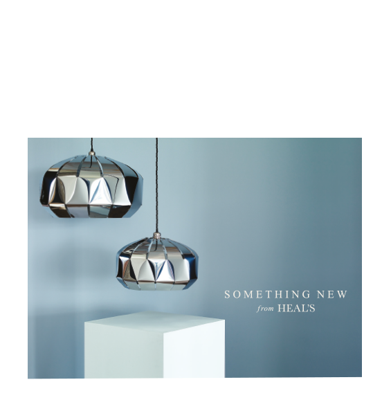
Furniture retailer Heal’s invited us to deliver a rebrand that would re-establish its contemporary design credentials and help it connect with its target customers. For this project we created a new logo, typeface, visual identity and colour palette for this iconic British brand – one of the world's oldest established retailers.


Furniture retailer Heal’s invited us to deliver a rebrand that would re-establish its contemporary design credentials and help it connect with its target customers. For this project we created a new logo, typeface, visual identity and colour palette for this iconic British brand – one of the world's oldest established retailers.

Read More ×


Heal's of London has been making and retailing furniture from its flagship store on Tottenham Court Road since 1818. It has been at the heart of the most influential design movements over the last 200 years and remains passionate about pushing the boundaries of outstanding contemporary design.

The Grid won a three-way pitch to deliver a new brand identity that would move it on from a black and white colour scheme in favour of a strong accent colour that the brand could own – in much the same way that Selfridges is represented by bright yellow. There was also a call to revisit the brand's past and take inspiration from the logo that was used in the 1930s when the business was called Heal & Son.

The resulting rebrand included a redrawn Heal's logo set in Baskerville, the introduction of brand colours orange alongside two complimentary shades of grey. The Grid also art directed new brand photography that moved away from traditional room sets towards bold imagery that hero uncluttered statement pieces with scaled-back styling and bold lighting. We produced a comprehensive set of brand guidelines and a store catalogue showcasing the new brand direction.

Back ×


Makers of strategic,
creative content that drives consumer engagement.

Designing brands, imagining campaigns and delivering seamlessly integrated marketing stories for the digital age.

Makers of strategic, creative content that drives consumer engagement.

Designing brands, imagining campaigns and delivering seamlessly integrated marketing stories for the digital age.


Show branding, marketing assets, and sales tools for the TV game show format ‘Love Island’.


Show branding, marketing assets, and sales tools for the TV game show format ‘Love Island’.


Show branding, marketing assets, and sales tools for the TV show ‘Black Ops’.


Show branding, marketing assets, and sales tools for the TV show ‘Black Ops’.


Identity and event design for ITV Gala, a red carpet event live at the London Palladium.


Identity and event design for ITV Gala, a red carpet event live at the London Palladium.


Produced by ITV Studios and Pukeko Pictures in association with Weta Workshop, Thunderbirds Are Go! is the re-imagining of the classic series using a groundbreaking mix of CGI animation against live-action miniature backgrounds.

The Grid worked with ITV Studios’ very creative Marketing team on A multi-phased campaign that built anticipation and interest in the brand. Developed the franchise to retail partners, global licensees and generated engagement with kids.


Produced by ITV Studios and Pukeko Pictures in association with Weta Workshop, Thunderbirds Are Go! is the re-imagining of the classic series using a groundbreaking mix of CGI animation against live-action miniature backgrounds.


The Soho House Group have an annual one day festival and ITV are one of the main sponsors. ITV asked us to create the branding and design elements for the event from the promotional elements to the event experience.


The Soho House Group have an annual one day festival and ITV are one of the main sponsors. ITV asked us to create the branding and design elements for the event from the promotional elements to the event experience.


Online furniture retailer MADE.COM approached us to create a multi-channel advertising campaign that would drive brand awareness and build its customer base. The result was ‘Made You Look’, a series of bold, disruptive messages that ran across three seasonal campaigns.


Online furniture retailer MADE.COM approached us to create a multi-channel advertising campaign that would drive brand awareness and build their customer base. The result was ‘Made You Look’, a series of bold, disruptive messages that ran across three seasonal campaigns.

Read More ×


When MADE.COM launched in 2010, its business model (offering designer furniture at affordable prices by connecting customers directly with designers) was unique, as was its visual style. Over time, competition with similar ideas and approaches emerged and MADE.COM found that it needed to clearly differentiate its brand.

MADE.COM briefed us to make it stand out and clearly communicate its core brand message “great design direct from the makers” with a campaign that could be rolled out across multiple channels, both on and offline, and also be adapted for multiple seasons.
In response, we developed a campaign idea called ‘Made You Look’ which combined colourful composite images with an attention-grabbing play on words. Bold images of pastel-painted tools were created to instantly catch the viewer’s attention whilst acting as a visual reference to the processes used to make the featured products. The use of graphic styling reinforced the concept, encouraging more than a cursory glance at the finished executions.

We adapted the campaign for three different seasons by changing colour palettes and styling. It ran across press, billboards, online banners and websites.

Back ×


We adapted our Made You Look campaign for Christmas using the strapline 'Surprise your home this Christmas’ and having a strong metallic theme running through the campaign.


We adapted our Made You Look campaign for Christmas using the strapline 'Surprise your home this Christmas’ and having a strong metallic theme running through the campaign.


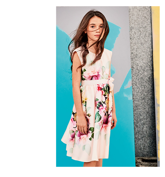
Fashion retailer Monsoon asked us to conceive, art direct and produce a marketing concept for its AW16 Childrenswear that would run across all marketing touchpoints including instore, window displays, websites and social channels. We developed the ‘PLAY GORGEOUS’ message and a lifestyle creative.


Fashion retailer Monsoon asked us to conceive, art direct and produce a marketing concept for its AW16 Childrenswear that would run across all marketing touchpoints including instore, window displays, websites and social channels. We developed the ‘PLAY GORGEOUS’ message and a lifestyle creative.

Read More ×


The first Monsoon boutique opened in 1973, and since then it has become a British institution. Monsoon has always championed creativity, individuality and craft in its clothing and accessories, with an attention to detail and commitment to ethical trading that never goes out of style.

Monsoon briefed The Grid to create an original look and feel for the brand's AW16 Childrenswear – and deliver a unified campaign that would work across all consumer touchpoints, including in-store windows and web content. It needed to capture the richness of the range, as well as a touch of party season sparkle.
Fashion retail is a hugely competitive environment but Monsoon has always remained true to its values with beautifully made clothes and accessories and a sustainable, ethical approach to business. The brand also has a playful charm that we were keen to bring to the fore through this project.

So we created ‘Play Gorgeous’, taking Monsoon Childrenswear in a more lifestyle direction. We paired beautiful photography with bold messaging to celebrate the craft and detailing of the products, whilst capturing the unique charm of the brand through moments of play, relaxation and friendship.

Back ×


As part of our ongoing work with Monsoon we helped launch its tween brand, STORM. We created a short film for social media that showed the seasonal shoot being produced by a group of talented teenagers we called the Storm Style Crew.


As part of our ongoing work with Monsoon we helped launch its tween brand, STORM. We created a short film for social media that showed the seasonal shoot being produced by a group of talented teenagers we called the Storm Style Crew.


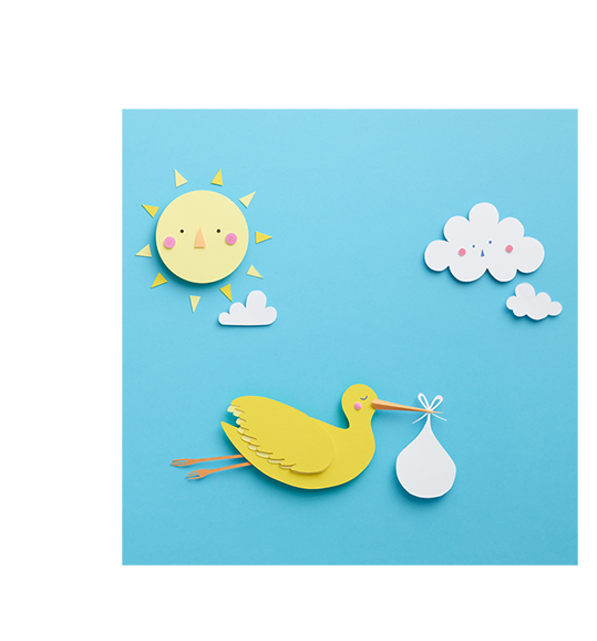
For Mothercare’s SS17 Catalogue The Grid developed ‘I Wonder’, a campaign that looked to capture the bubbling curiosity and excitement that runs through the mind of any parent-to-be as they anticipate their baby's arrival. Pregnancy is a time, not only to plan ahead and think about the practical stuff, but also to dream about what a baby-filled future will be like.


For Mothercare’s SS17 Catalogue The Grid developed ‘I Wonder’, a campaign that looked to capture the bubbling curiosity and excitement that runs through the mind of any parent-to-be as they anticipate their baby's arrival. Pregnancy is a time, not only to plan ahead and think about the practical stuff, but also to dream about what a baby-filled future will be like.

Read More ×


When it opened its first store in Surrey in 1961, Mothercare focused on selling pushchairs, nursery furniture and maternity clothing. Now, over 55 years later, the brand is a specialist retailer of products for parents, babies and children up to the age of eight.

For Mothercare’s SS17 catalogue, The Grid developed ‘I Wonder’, a campaign that looked to capture the bubbling curiosity and excitement that runs through the mind of any parent-to-be as they anticipate their baby's arrival. Pregnancy is a time, not only to plan ahead and think about the practical stuff, but also to dream about what a baby-filled future will be like.
As part of the overall art direction of the catalogue, we art-directed and produced all the content for the home and travel sections and helped develop the imagery for both print and digital usage. We also created a comprehensive style guide to ensure consistency across all the sections of the 380-page catalogue, the brand's website and app.

Mothercare is also looking to redesign its stores worldwide and briefed us to re-think the instore experience at its largest UK store. Our approach looked to inject colour, emotion, wit, love, and an experienced understanding of modern parenting.

Back ×


Mothercare is also looking to redesign its stores worldwide and briefed us to re-think the instore experience at its largest UK store. Our approach added colour, emotion, wit, love, and an experienced understanding of modern parenting.


Mothercare is also looking to redesign its stores worldwide and briefed us to re-think the instore experience at its largest UK store. Our approach added colour, emotion, wit, love, and an experienced understanding of modern parenting.


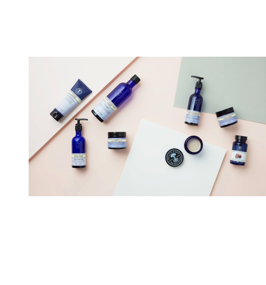
Beauty retailer Neal’s Yard Remedies asked us to re-evaluate its brand imagery and also the consumer catalogues which remain an important part of its communications mix. We maintained the brand’s focus on natural ingredients whilst delivering a fresher and cleaner approach that was easier to navigate.


Beauty retailer Neal’s Yard Remedies asked us to re-evaluate its brand imagery and consumer catalogues which remains an important part of its communications mix. We maintained the brand’s focus on natural ingredients whilst delivering a fresher and cleaner approach that was easier to navigate.

Read More ×


Neal's Yard Remedies opened its first store in 1981 in Covent Garden, London. It is now one of the UK's leading organic beauty brands, offering a premium range of nature-inspired products across beauty, skincare and wellbeing. Honesty and transparency is at the heart of the Neal's Yard brand.

In an increasingly digital world, print brochures still play a big role in the Neal's Yard marketing mix – and the brochures have a tactile, high quality feel, much like the brand's products. However, the catalogues had started to feel cluttered and difficult to navigate so Neal's Yard approached The Grid and asked us to take a fresh look.
We wanted to reflect the brand’s confidence in its ethical convictions in our catalogue design, so we took a more editorial direction, commissioning bold, clear photography that showcases the brand's iconic blue bottles in a way that allows customers to read the labels of each product clearly in images that could be also used as leading brand visuals across print and online channels.

The resulting catalogue was the brand's best selling catalogue to date and its publication also saw a huge 400% increase in press requests for the imagery – as well as a corresponding uplift in Social engagement.

Back ×